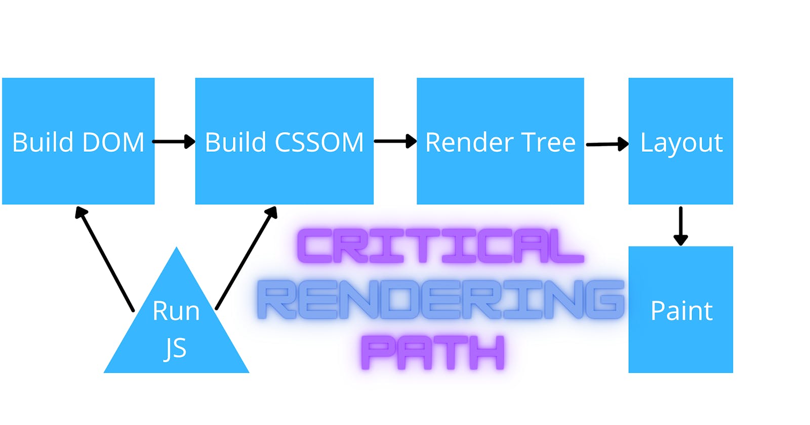
When the browser receives HTML response for a page from a server, there are some steps that need to be done before you could even see the page on your browser's screen. Now, Critical Rendering Path is the sequence of those steps the browser goes through to convert the HTML, CSS, and JavaScript into pixels on the screen. You know that optimizing the critical rendering path can improve the render performance of the page. So, Knowledge of the Critical Rendering Path is useful for understanding how a site's performance can be improved on the first render.
There are 6 steps the browser goes through in CRP:
- Constructing the DOM Tree
- Constructing the CSSOM Tree
- Running JavaScript
- Creating the Render Tree
- Generating the Layout
- Painting
1. Constructing the DOM Tree
The DOM (Document Object Model) Tree is an Object representation of the fully parsed HTML page. Tarting with the root element, , nodes are created for each element/text on the page. Elements nested within other elements are represented as child nodes and every node contains the complete attributes for that element. The greater the number of nodes, the longer the subsequent events within the critical rendering path will take.
2. Constructing the CSSOM Tree
The CSSOM (CSS Object Model) is an Object representation of the styles associated with the Document Object Model. The CSSOM contains all the styles of the HTML page i.e information on how to style that DOM. CSSOM is similar to the DOM, but it is different from it. The DOM construction is incremental, while CSSOM is not. CSS is render blocking: the browser blocks page rendering until it receives and processes all of the received CSS. CSS is render blocking because rules are often overwritten, therefore the content can't be completely rendered until the CSS Object Model is complete. Unlike HTML, CSS cannot be utilized in parts due to its inherited cascading nature. Styles defined later within the document can override and alter styles that were previously defined. So, if we start using CSS styles defined earlier within the stylesheet before everything of the stylesheet has been parsed, we may get a situation where the incorrect CSS is being applied. This means that CSS must be fully parsed before we can move on to the next stage. CSS can also be "script blocking". This is because JavaScript files must wait until the CSSOM has been constructed before it can run.
3. Running JavaScript
JavaScript is considered a parser blocking resource. This means that the parsing of the HTML document itself is blocked by JavaScript. when HTML parser reaches script tag it pauses the HTML parsing. Then it starts fetching and executing javascript. To fix this we've to use async or defer in our external script file or should use script tag at the bottom of the body if script is internal. I have written a detailed blog on async-defer, check it for more info: efficiently load script file in javascript using async and defer
4. Creating the Render Tree
The render tree captures both the content and the styles: the DOM and CSSOM trees are combined into the render tree. To construct the render tree, the browser checks every node, starting from the root of the DOM tree, and determines which CSS rules are attached to it. This means that it only captures the visible content and can't include, for example, elements that are hidden with CSS using display: none.
5. Generating the Layout
After render tree, building layout is possible. Layout depends on the viewport size of the window, which provides context for CSS styles that are dependent on it, e.g. percentage or viewport units (vh, vw). The viewport size is decided by the meta viewport tag provided within the document head or, if no tag is provided, the default viewport width of 980px is used. On by-default full screen browsers, like your phone's browser, by setting the width are going to be width of the device rather than the default viewport width.
<meta name="viewport" content="width=device-width, initial-scale=1">
The user visits the webpage on a device with a width of, for example, 1000px, then sizes will be based on that unit. Half the viewport are going to be 500px, 10vw are going to be 100px, and so on. The device-width changes when a user rotates their phone between landscape and portrait mode. Layout happens whenever a device is rotated or browser is otherwise resized.
6. Painting
Finally the last step is painting the pixels on the screen. Once the render tree is made and therefore layout occurs, the visible content of the page is converted to pixels to be displayed on the screen. Paint time depends on what type of updates are being applied to the render tree. Some styles require more work to execute than other styles. For example, a complicated gradient background image requires more time than the simple solid background color.
Optimizing CRP
Optimizing critical rendering path isn't only about setting code-splitting. Our code must be checked if there’s potential unnecessary rendering at the highest level also. That would make the code-splitting more optimized and significantly improve performance. Performance tips include:
- minimizing the number of critical resources by deferring their download, marking them as async, or eliminating them altogether.
- optimizing the number of requests required along with the file size of each request
- optimizing the order in which critical resources are loaded by prioritizing the downloading critical assets, shorten the critical path length.
